Content for Printo

Brand, Web/Landing Pages

Printo is a 17-year old Bengaluru-based organization that revolutionized the print-on-demand space back when they launched. Over the years, they’ve expanded and pivoted many, many times but their communication has been pretty simple and straightforward. It definitely did not reflect all the interesting categories they’d expanded into.

In January 2023, I got the opportunity to work with their marketing team to refresh their messaging for these lesser-known verticals and train the tiny in-house team to ideate, write, and design better. I had big plans for this project but in May 2023, the entire marketing team was laid off and my engagement came to an abrupt end. Such is life!

Most of the work we’d put in was at a nascent stage and hardly any of it went live. I do want to talk about one of the projects because I think we did have the right ideas.

The goal: Printo had established itself as a go-to place for retail customers (individuals) to take document printouts, print photo books, and create custom gifts. The business team had curated extensive offerings to serve the Corporate Gifting space and wanted to target the vibrant startup ecosystem in Bengaluru. The question was: how could one come up with messaging that resonated with this audience?

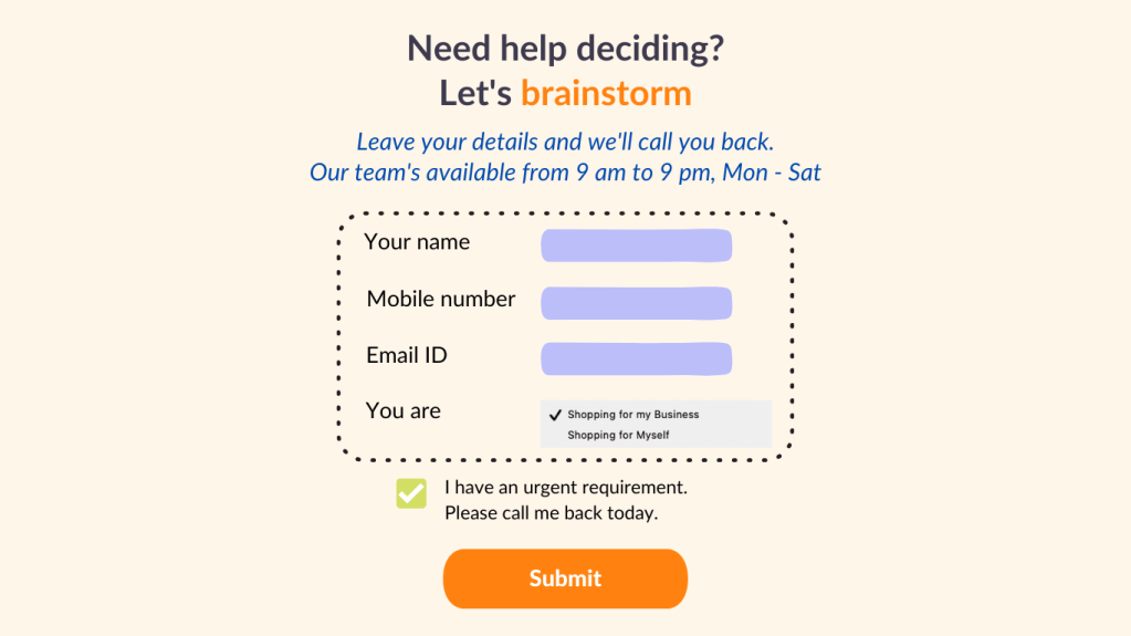
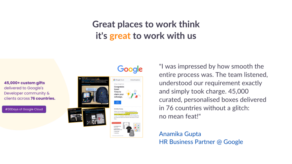
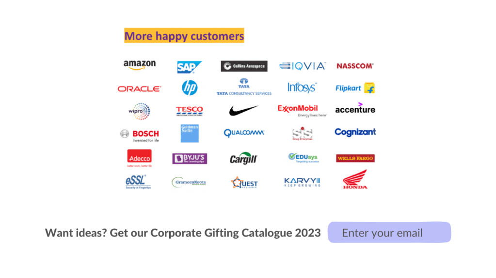
What their existing landing page for Corporate Gifting looked like:

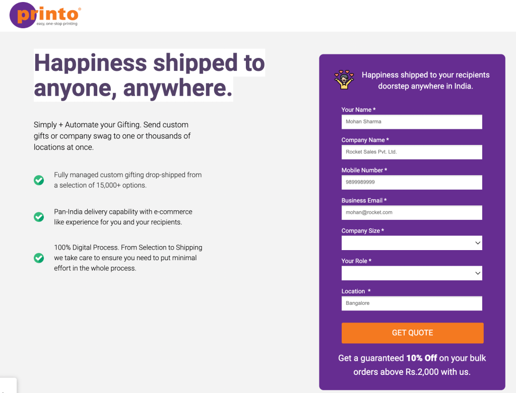
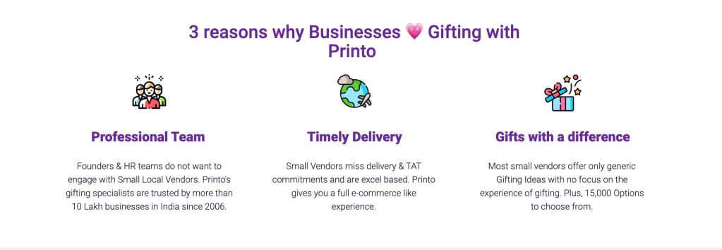
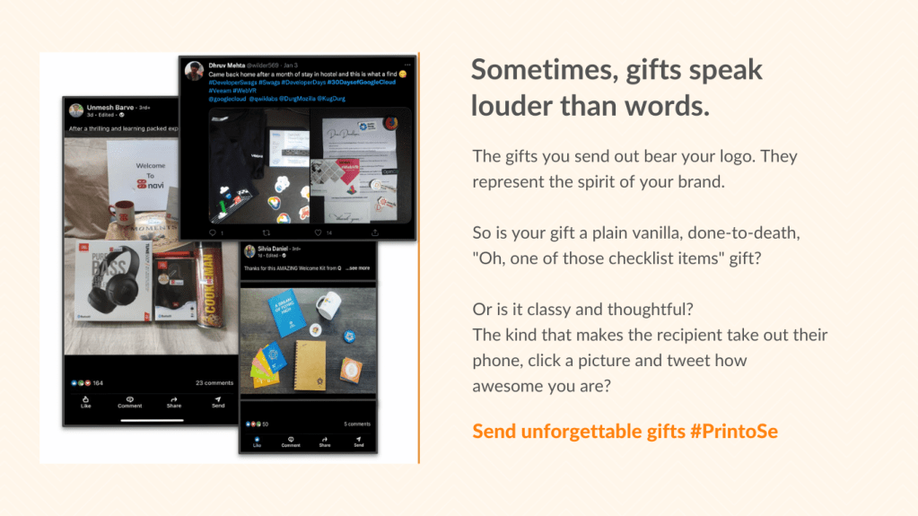
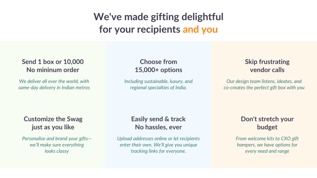
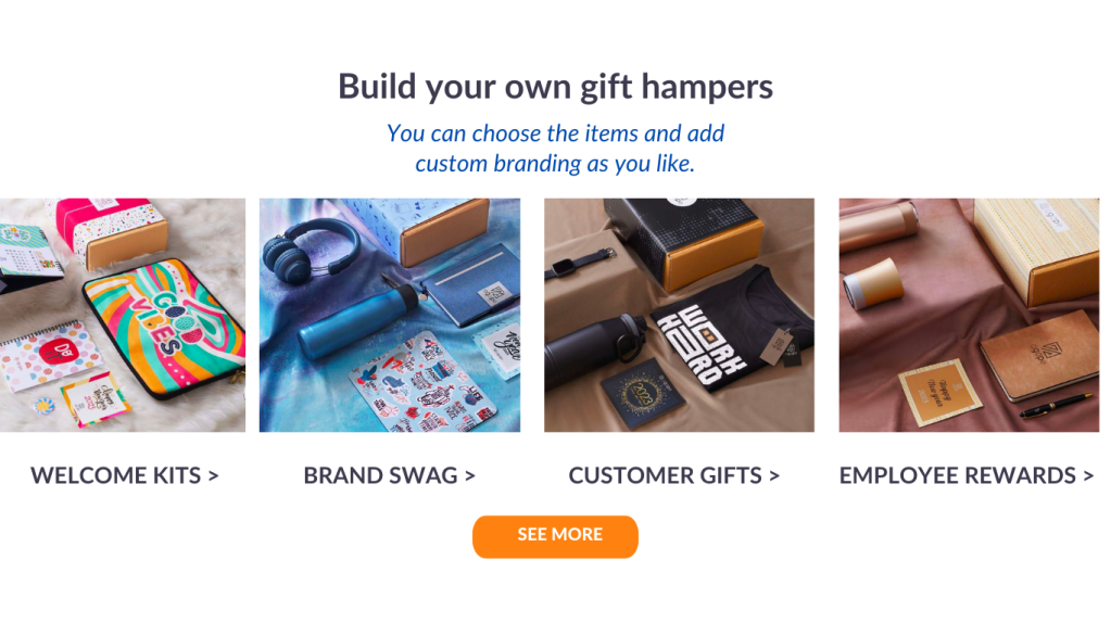
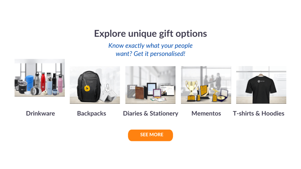
As you can see, there was very little storytelling and nothing that differentiated Printo from others in this high-competition, operationally-heavy space. In reality, Printo’s offering was very different and designed to simplify the way gifting is done. Operationally easy for the admin/ops/HR folks on the procurement side, lots of options for them to choose from, and reliable too.

In the revised wireframe I suggested, I tried to bring out all these aspects while also leveraging Printo’s long legacy in Bengaluru. Please note: these are rudimentary Canva pumpkins that didn’t get to be transformed into glass slippers by the magical touch of a professional designer.

Copywriting for cultsport

Brand, Emails, Social media

Part of the cult.fit family, cultsport is a new line of business for all things sport: workout equipment, activewear, nutraceuticals, and more. cultsport aspires to speak in an energetic, clear, relatable voice, with a focus on showing up and being a wee bit better everyday. From June to October 2022, I worked with their marketing team on store banners, ads, and emails. Here are a few.

A fun fitness email: If you could pick only one fitness equipment to work out at home, which one would you pick? A complicated choice, much like evaluating candidates.

In-app store banners: Workouts aren’t always work—they can be fun! I’ve tried to bring out that spirit in cultsport’s app banners, which inspire and sell (because CTR!)

Brand story for Frontier X

Brand

Frontier X is one of the world’s most advanced wearables that listens to your heart and your lungs. It measures the metrics that truly matter and help you train better. I was approached by the founding team of Frontier X to put into words their vision and the powerful capabilities of their product.

The challenge here was to understand the science and the technology behind the product as well as the brand’s audience (35+ | M & F | Fitness enthusiasts | Active lifestyle | Often engage in multiple sports | North America) and weave a story that conveyed energy, focus and authenticity without being pedantic or heavily technical.

Over multiple brainstorming sessions, we managed to identify the key USPs of the product, simplify the science and the technology behind it, and build a smart narrative style. The brand’s tagline was discovered during one of these chats during which the founder was repeating a conversation he’d had with a friend. The moment he used this phrase, I had a tingle in my spine. “That’s it!” I said excitedly, “That’s our line. Frontier X — Measure what matters.”

And it was.

Screenshot 2020-01-24 at 1.49.41 PMScreenshot 2020-01-24 at 1.50.01 PMScreenshot 2020-01-24 at 1.50.14 PMScreenshot 2020-01-24 at 1.50.26 PMScreenshot 2020-01-24 at 1.51.37 PMScreenshot 2020-01-24 at 1.52.03 PM

Explaining the science so that it is easy to read and understand while not so dumbed down that it puts off advanced users.

Messaging for promotions and social media.

Screenshot 2020-01-24 at 1.56.12 PM

Wordtoons GRE Flashcards

Brand, Merchandise, Print

Thousands of Indian engineers take the GRE each year and a majority of them struggle with the Vocabulary section that requires them to know the contextual meanings of words not used in everyday conversations.

Wordtoons is a set of GRE flashcards designed especially for Indian GRE aspirants. Through visual cues and silly vernacular clues, they make learning fun and help the words and their meanings sticky.

I conceptualized ~150 of these flashcards and worked with an illustrator to get them created. These are offered as part of the GRE course material at CrackVerbal and also retailed on Amazon.