Give is India’s largest charitable fundraising platform that runs on a monthly giving model. They work with verified non-profits, not individuals, and cover missions related to human upliftment: education, hunger, elder care, disability support, and poverty. From 2018-2019, I worked with their tiny but passionate marketing team to create and execute their communication strategy.
At the time, communication was one of the biggest challenges that Give faced. The fundraising industry was full of players who used poverty porn and emotional blackmail to get donations. Not only were the visuals triggering but after a point, people began to be de-sensitized to the plight of others.
I helped the team establish communication guidelines that would apply in everything we put out: emails, social media, and ads. Here’s a short overview of what we crafted over many months:
#1 Treat both donors and beneficiaries with respect. Donors are not cash cows; respect their preferences and limitations. This means no messaging that makes them feel shame for their privilege or guilt about not doing enough. Beneficiaries are not victims; be sensitive with the vocabulary used when referring to them. This means no visuals of sick babies and weeping adults.
#2 Show donors the power of their actions. People give when they connect with a cause. But they also want to know if what they’re doing has any impact at all. Show donors who they are helping—real people with hopes and dreams. Share the impact of their contribution through quantitative updates, but more importantly, through stories of hope and upliftment.
#3 All messaging should pass the PCD test: Positive, Dignified, Compassionate. All communications and creatives must meet at least two out of these three tenets of voice and certainly nothing that goes against them.
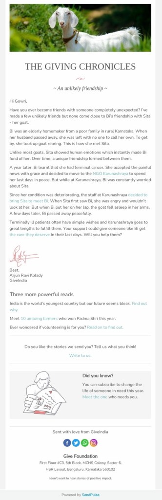
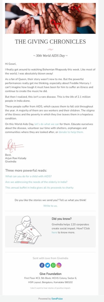
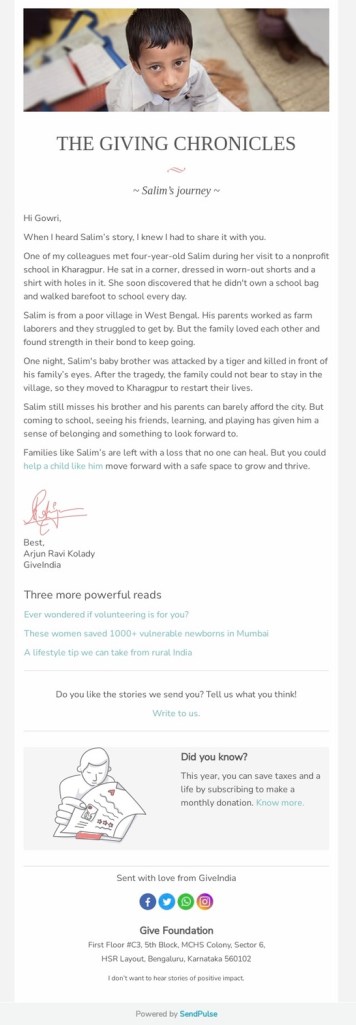
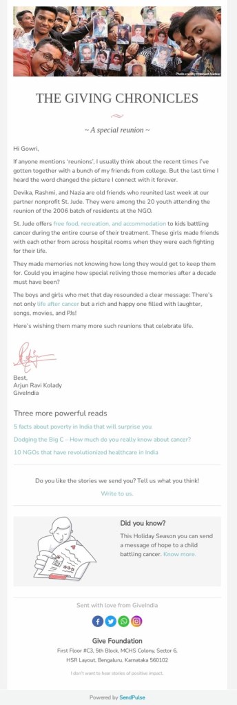
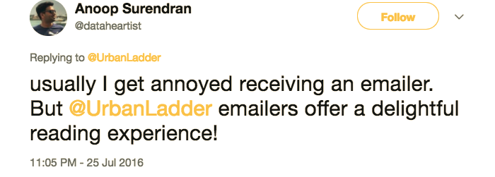
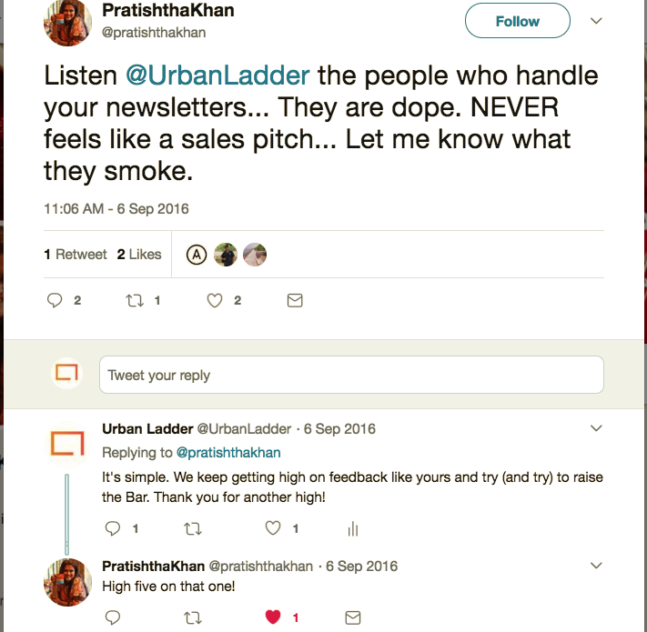
I also helped the Give team overhaul their newsletter. From sporadic donation appeals, we turned The Giving Chronicles into a short weekly dispatch that turned the spotlight on one hero story in every issue. For those who wanted to know more, we added a Recommended Reads linking to more impact opportunities and stories. We used this section to highlight causes that get less attention or missions urgently in need of support.
The simple, uncluttered layout and focus on words over visuals was a conscious effort to make The Giving Chronicles more letter than news. We also included a simple Did You Know? section to bring to light the lesser known aspects of Give’s functioning.
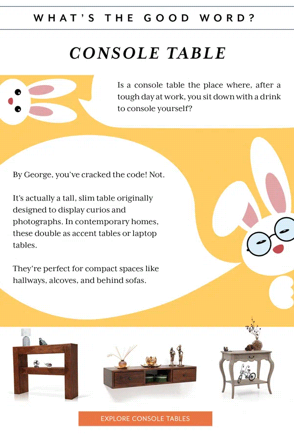
Here are a few examples of The Giving Chronicles that I worked on.


