[Spec Ad] A print ad for UPI

Brand, Print

In late 2019, Amazon Pay was trying to scale up their UPI customer base, having entered the game quite late. At the time, Google Pay was ruling the roost, itself soon to be deseated by PhonePe. I was a freelance communications consultant for Amazon Pay, commissioned to help the many business units under it bring some consistency to the brand voice and messaging. At the end of a 2-year engagement, we did a series of training sessions and closed with a Write Guide for the team.

But I digress.

Back in 2019, while Amazon Pay was trying to win over customers from Google Pay, I had this idea for a print ad. Never pitched it, knowing that one of the brand’s policies is to not take on the competition directly. But, it still remains one of my favourites.

Disclaimer: This ad was created on spec and was not commissioned/approved by Amazon Pay or published in the Times of India.

Bigbasket emails (Since 2019)

Brand, Emails

Nobody wants to read. Open rates are dead. Email is spam.

People have been saying this for years — I disagree. I think email is a powerful way to get someone’s attention. It is not intrusive like calls and messages; yet, more personal than ads & social media. It gives you a wonderful canvas to say what you want to. And it stays in someone’s inbox, more or less permanently.

Provided, of course, you do it well.

I have built up email strategy for a number of brands: nurture sequences at CrackVerbal to guide young professionals looking to study abroad; engaging newsletters at Urban Ladder to put the fun in furniture shopping; nudging parents to let children play wild & free at shumee toys; telling uplifting stories of giving without selling poverty porn at GiveIndia.

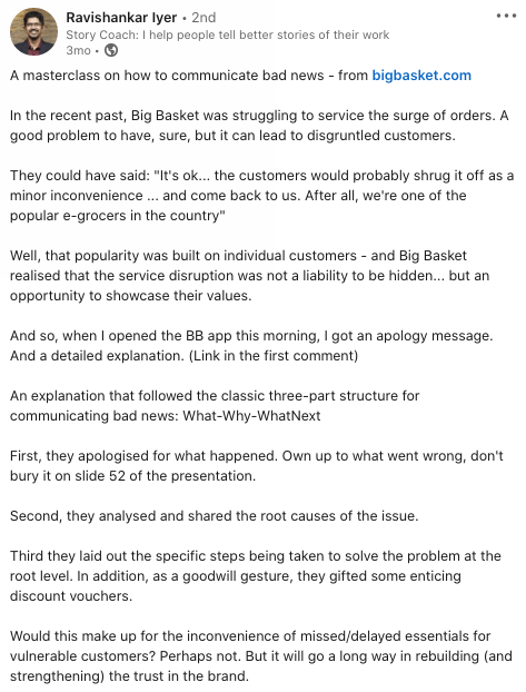
Since 2019, I have been doing this for the marketing team at bigbasket, India’s largest online supermarket. During the pandemic, bigbasket faced a massive surge in demand, coupled with operational challenges. In spite of their best efforts, they could not fulfill many orders, leaving customers disgruntled. The team’s first priority was fixing the issues. But once things were getting back to normal, they wanted to reach out to all their customers to explain what happened.

Before I set to work on this email, I had multiple conversations during which the team was very clear about the problem statement. ‘We did our best but we still disappointed some customers. This falls short of the service standards we set for ourselves. How can we make it better?’

All along, we have been working to craft Bigbasket’s voice to reflect its values: authentic, straightforward, heartfelt. No gimmicks. No deflective humour to draw attention away from the problem.

So that’s what we did here. We owned up. We explained what went wrong. We told customers what we are doing to make things better. And signed off with a coupon-equivalent of an apology bouquet. We also asked them to give us another chance— and I am happy to see some of the comments here expressing that sentiment. You can see the email here.

This email, sent to over 10 lakh people, caught attention and Bigbasket exceeded their expectations in terms of customers retained. It also created a buzz on social media.

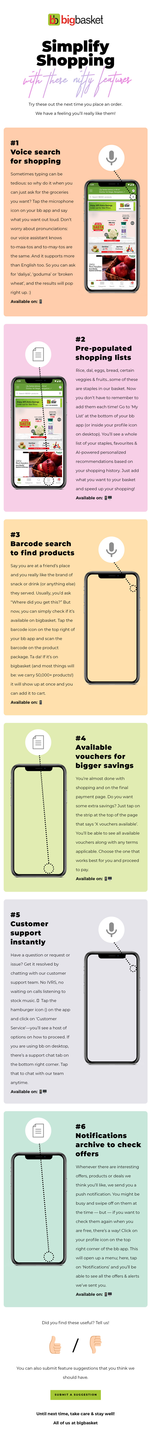
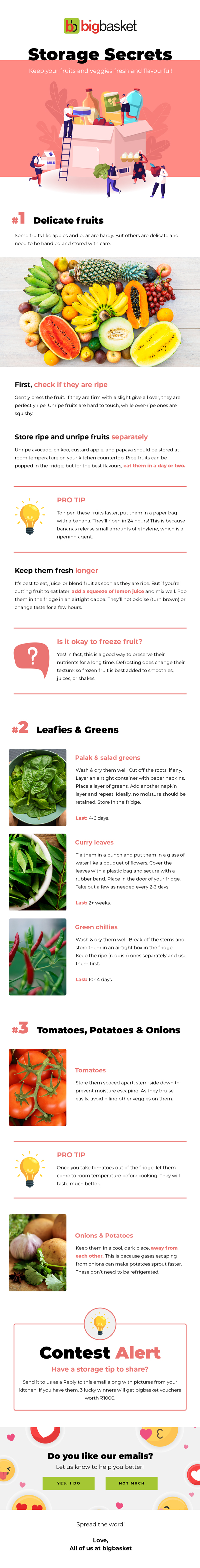
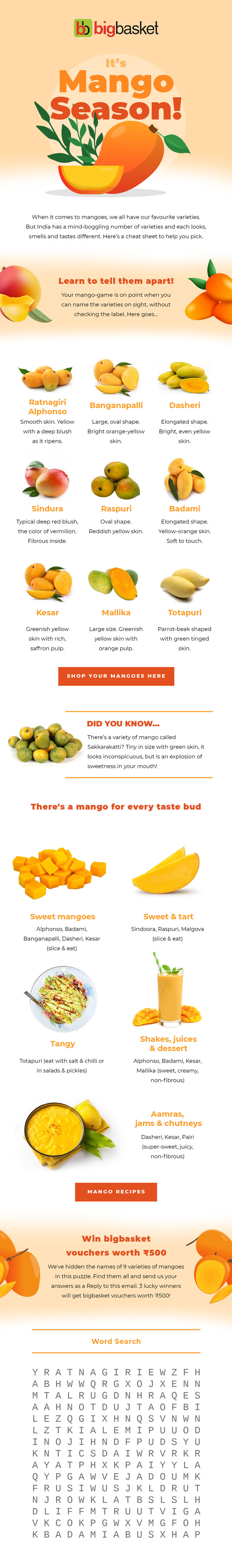
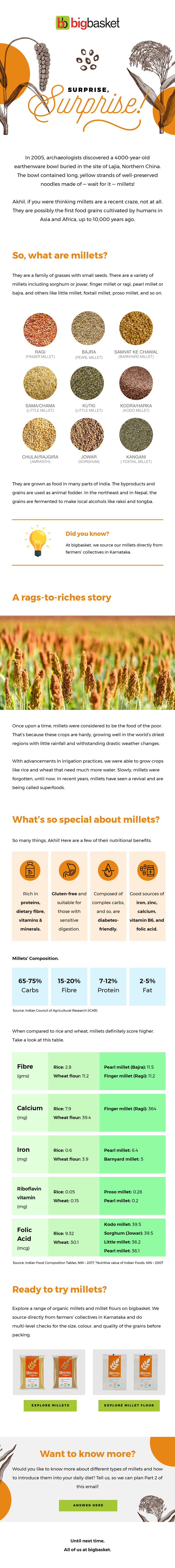
Is it possible to make fruit interesting? Or cooking oils? In bigbasket emails, we try. We do this by telling fascinating backstories, busting myths, and sharing practical tips. You can see examples here.

Women’s Fund Asia: Annual Report 2019-20

Brand, Print

Women’s Fund Asia is a feminist donor organization that works to uphold the rights and improve the condition of women and trans people in Asia. They do some stellar work in raising awareness, mobilizing resources, fundraising, building networks, and supporting regional feminist workers.

Every year, WFA brings out a richly illustrated Annual Report that captures the highlights of the year and tells stories about the impact the Fund has created. I worked with the wonderful illustrators at Ladyfingers Co to bring the 2019-20 report to life. This report won a Baby Blue Elephant at the 2021 Kyoorius Creative Awards.

Our starting material was a number of decks, quarterly reports, and meeting/conference notes that the WFA team had put together during the course of their work. I went through this extensively and did my own research to come up with a cohesive flow for the report, identify the most interesting, impactful stories, give layout ideas to the design team, and of course, write the report itself. Here it is.

What’s the Good Word?

Brand, Emails, Social media

When I first joined Urban Ladder, I didn’t know many design and decor terms. So, chenille meant nothing to me. Neither did console table, sectional, armoire, or chaise. We knew that many of our customers would be in the same boat and would appreciate a simple, pithy explanation for such “technical” terms. From that thought came a series of creatives that we put out through our (then) wildly popular newsletters and social media channels.

We called the series What’s the Good Word? It featured a helpful bunny (why not!) who would explain lesser-known terms to our readers. Design credits: Rumman Rizvi

When the Urban Ladder rebrand happened in 2017, we upgraded the design to something even cute and with two bunnies. This series got good feedback, so I have no idea why we didn’t do many more of them!

Brand story for Frontier X

Brand

Frontier X is one of the world’s most advanced wearables that listens to your heart and your lungs. It measures the metrics that truly matter and help you train better. I was approached by the founding team of Frontier X to put into words their vision and the powerful capabilities of their product.

The challenge here was to understand the science and the technology behind the product as well as the brand’s audience (35+ | M & F | Fitness enthusiasts | Active lifestyle | Often engage in multiple sports | North America) and weave a story that conveyed energy, focus and authenticity without being pedantic or heavily technical.

Over multiple brainstorming sessions, we managed to identify the key USPs of the product, simplify the science and the technology behind it, and build a smart narrative style. The brand’s tagline was discovered during one of these chats during which the founder was repeating a conversation he’d had with a friend. The moment he used this phrase, I had a tingle in my spine. “That’s it!” I said excitedly, “That’s our line. Frontier X — Measure what matters.”

And it was.

Screenshot 2020-01-24 at 1.49.41 PMScreenshot 2020-01-24 at 1.50.01 PMScreenshot 2020-01-24 at 1.50.14 PMScreenshot 2020-01-24 at 1.50.26 PMScreenshot 2020-01-24 at 1.51.37 PMScreenshot 2020-01-24 at 1.52.03 PM

Explaining the science so that it is easy to read and understand while not so dumbed down that it puts off advanced users.

Messaging for promotions and social media.

Screenshot 2020-01-24 at 1.56.12 PM